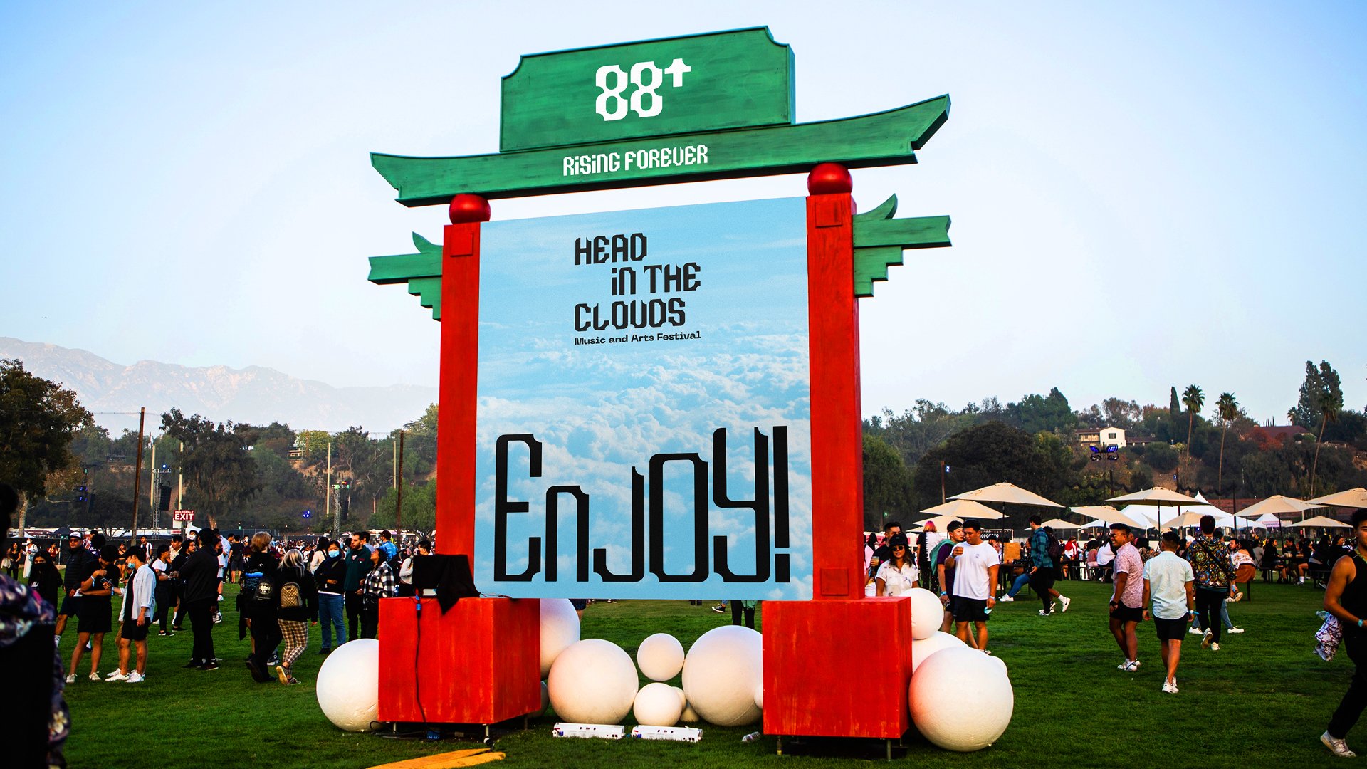
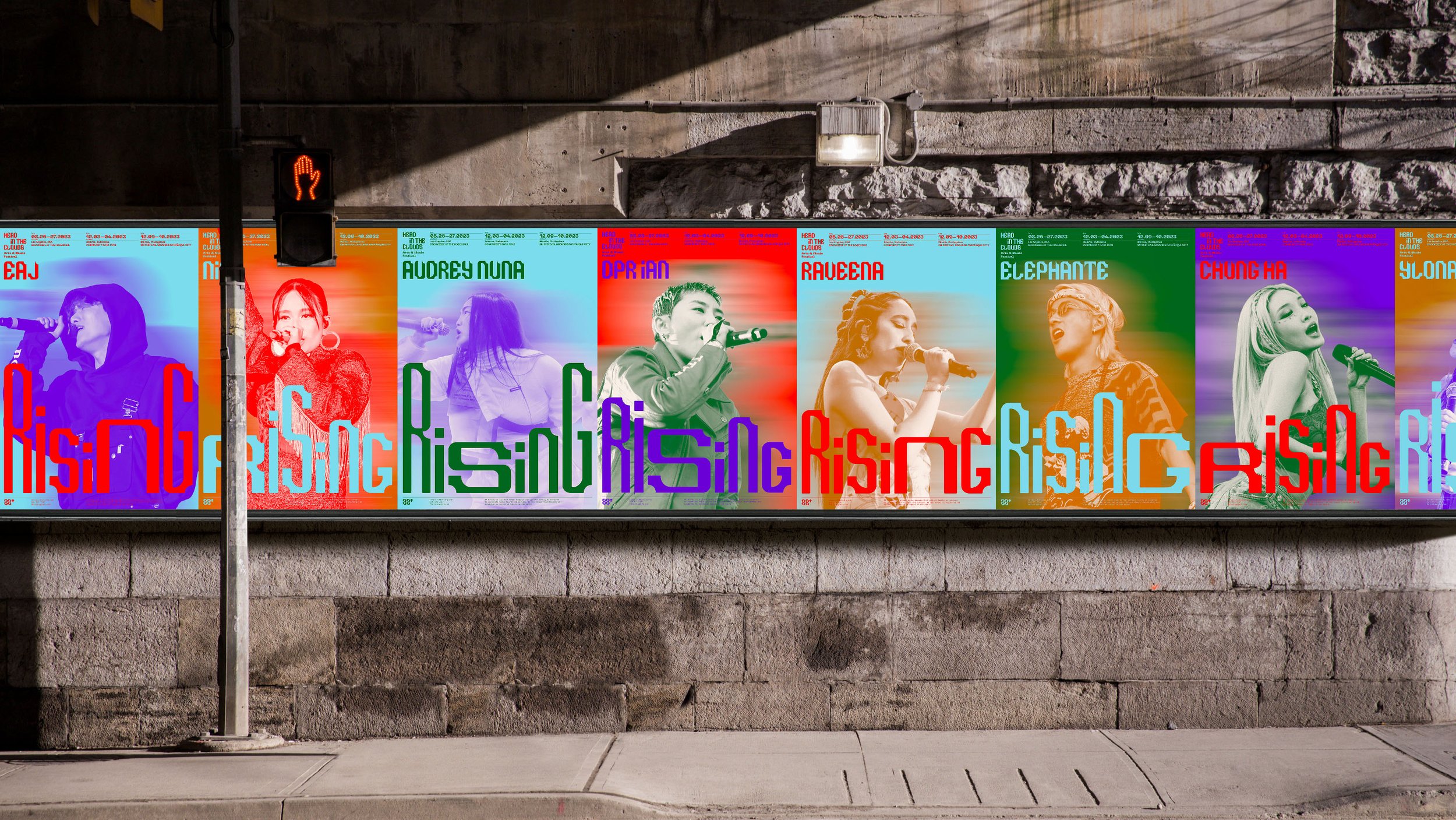
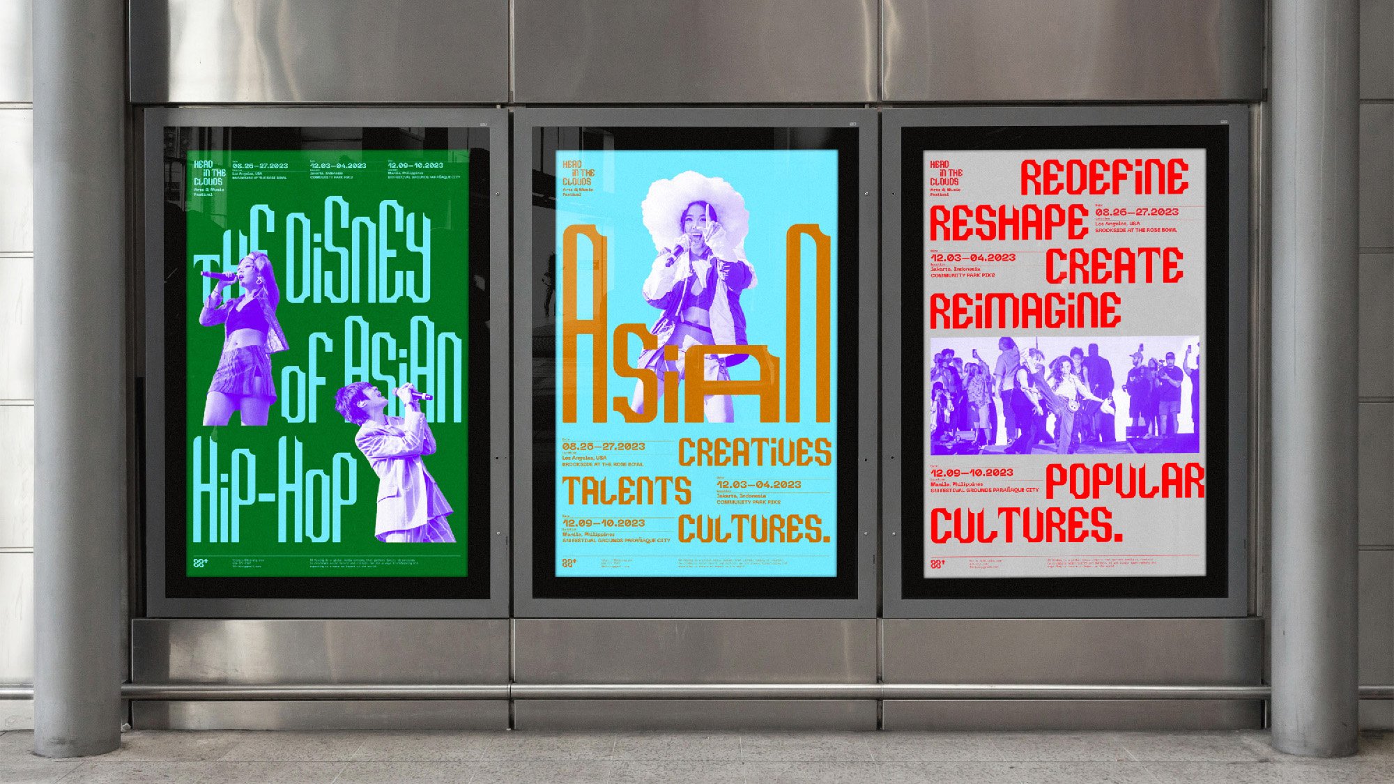
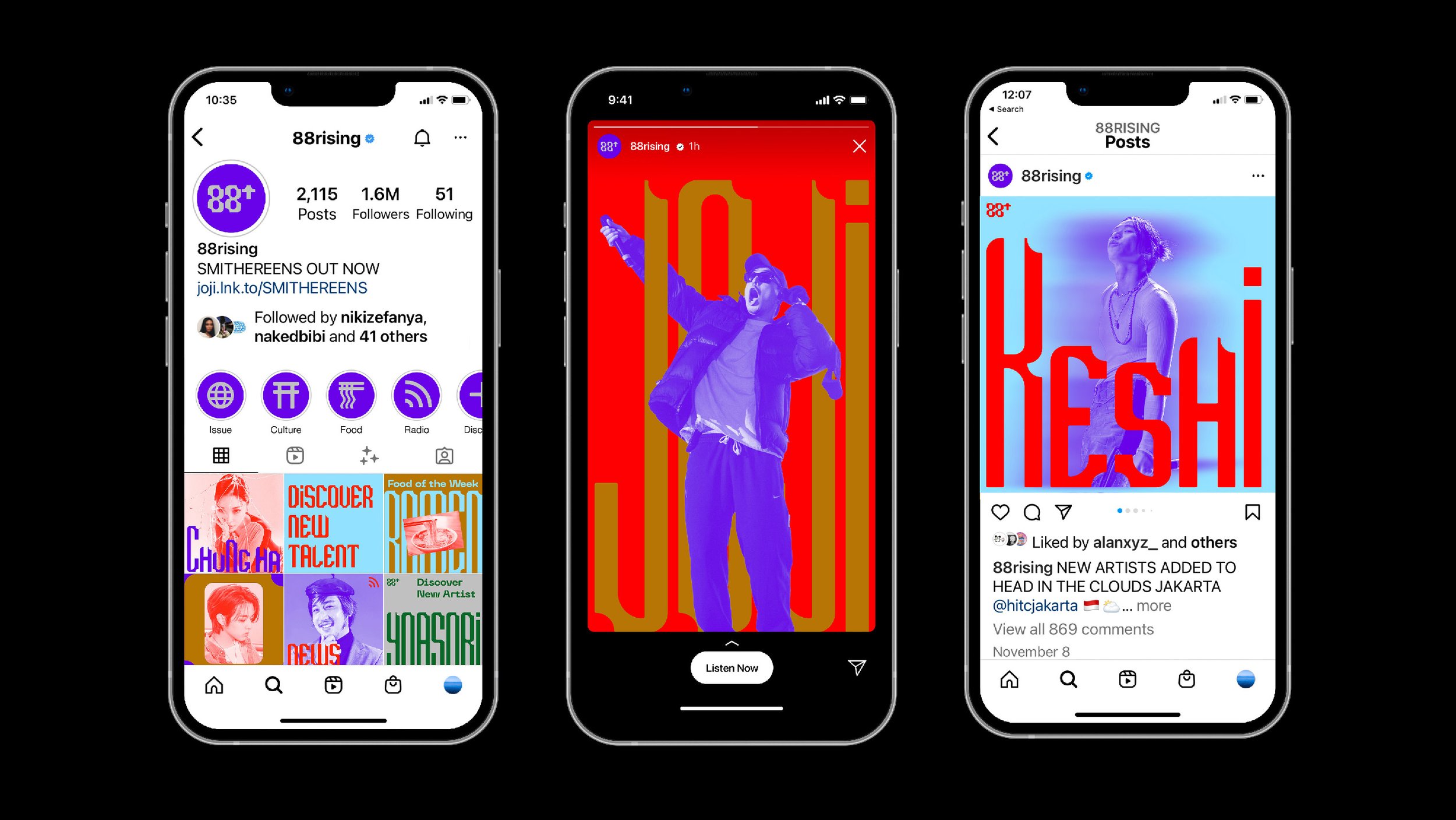
88rising Rebrand
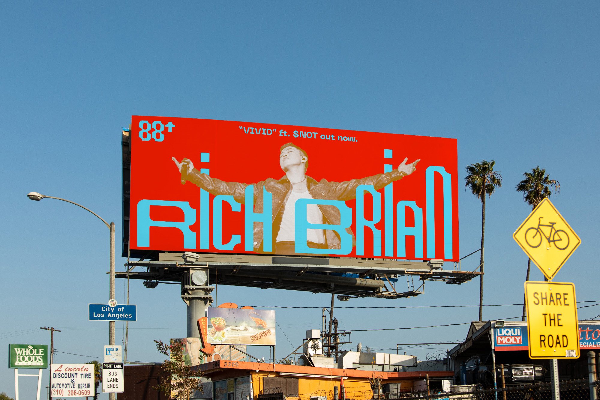
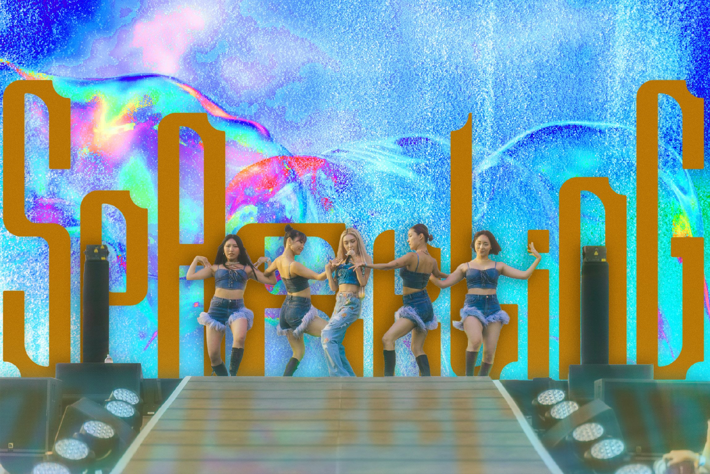
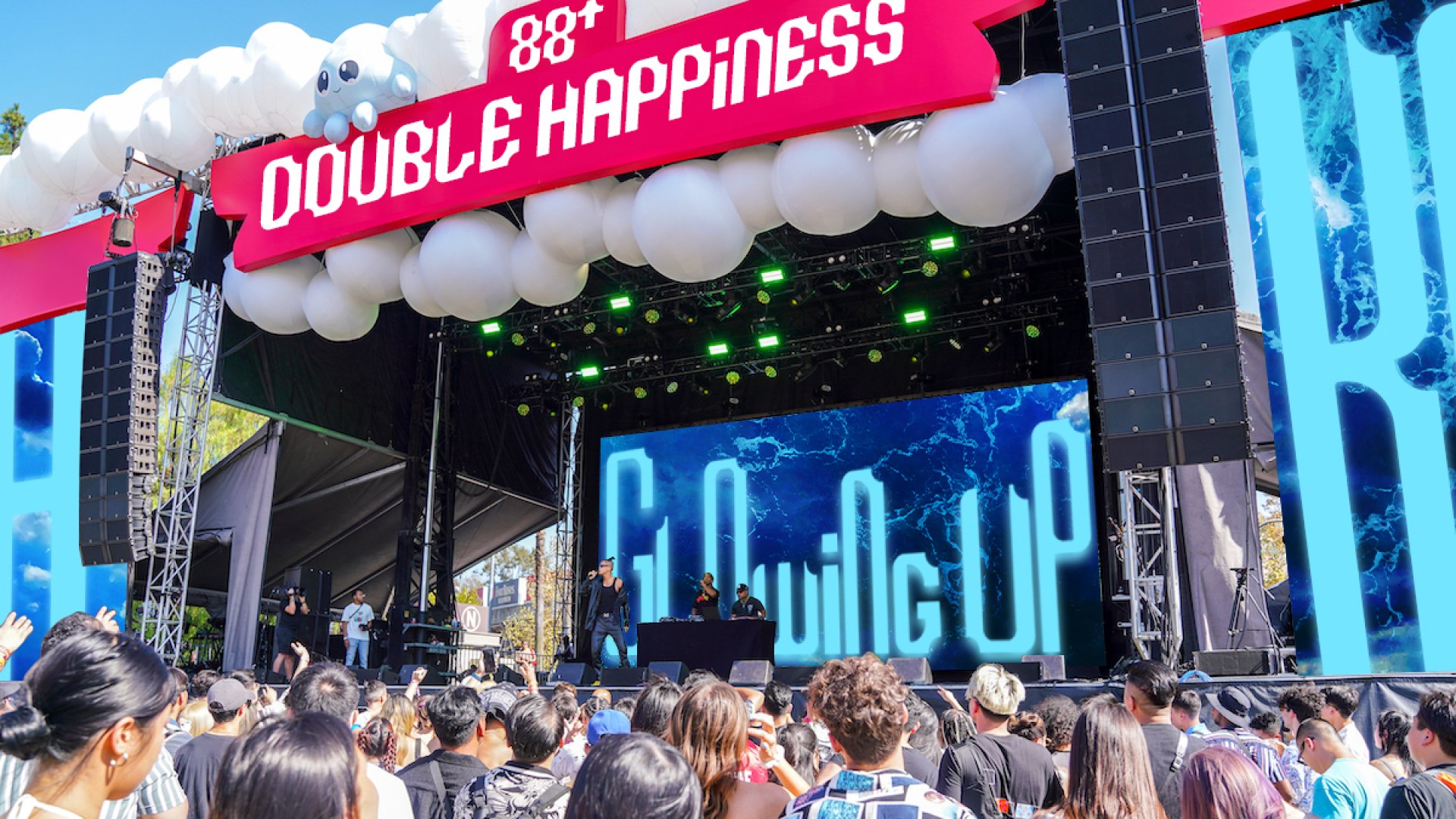
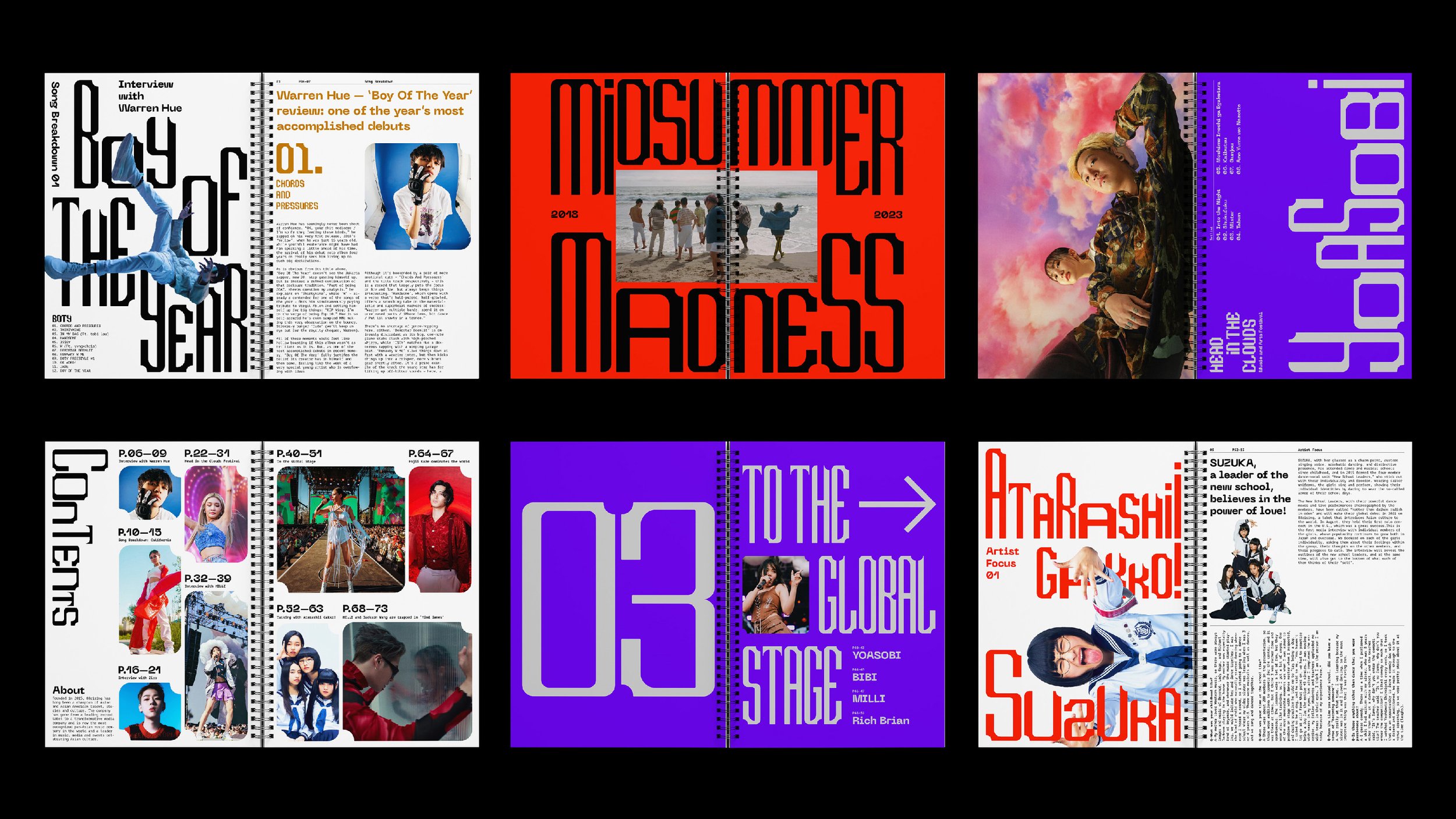
This is a rebrand project for 88rising, a media collective and record label that promotes Asian talent and culture. They organize the Head in the Clouds Festival, showcasing in-label and external artists.


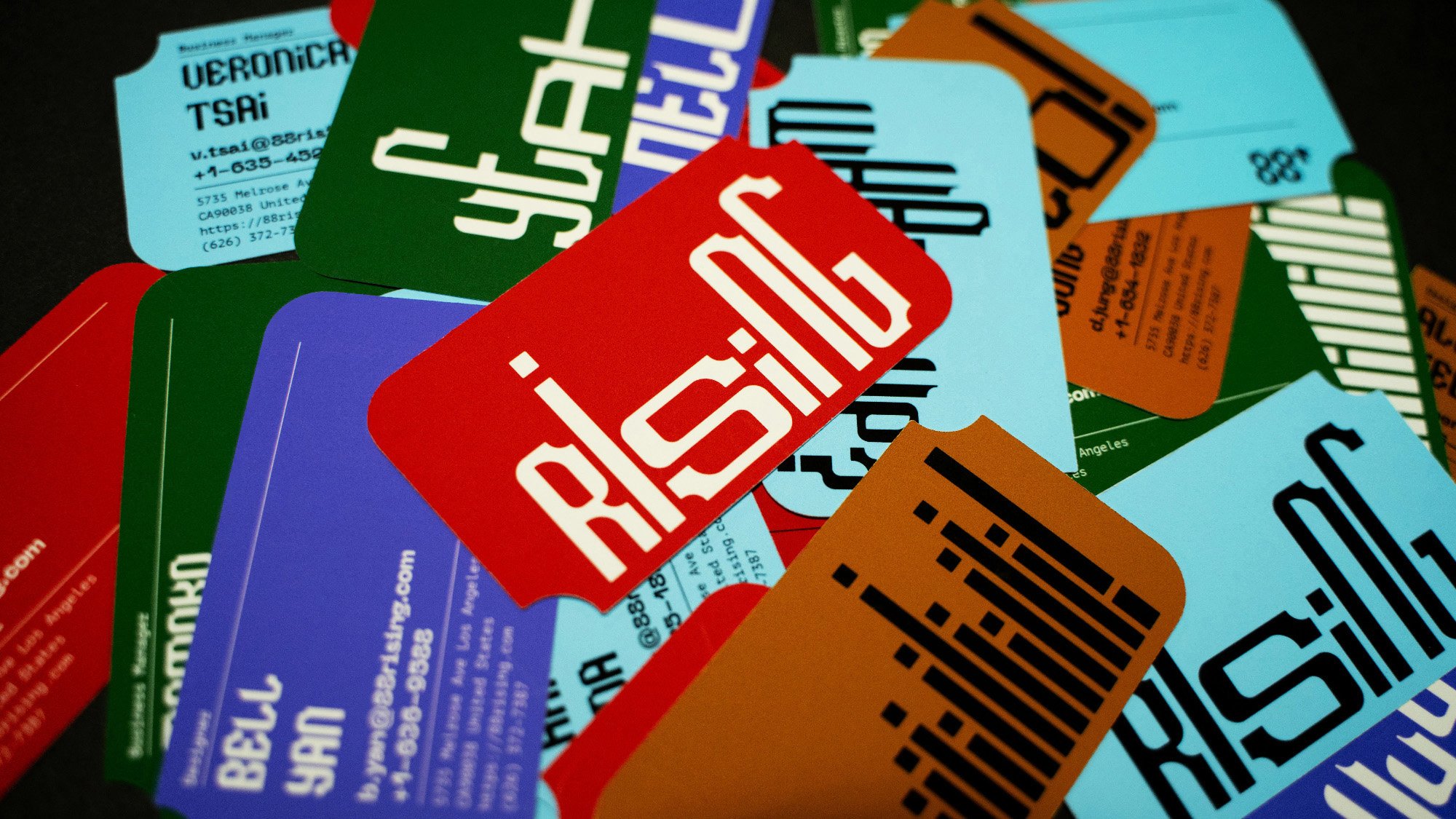
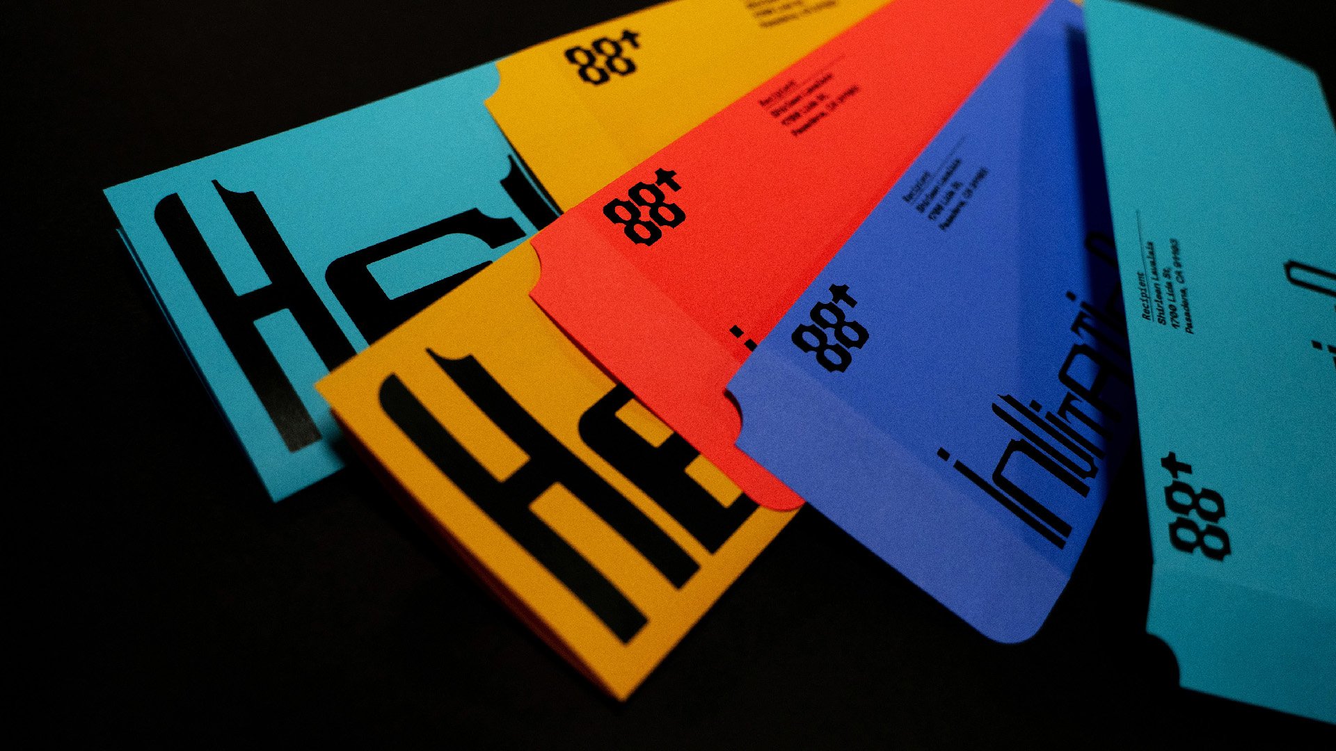
The original logo typeface, "Rising Super," embodies growth and inclusivity with its negative space in the corner, allowing both the artists and the audience to contribute to the completion of 88rising.


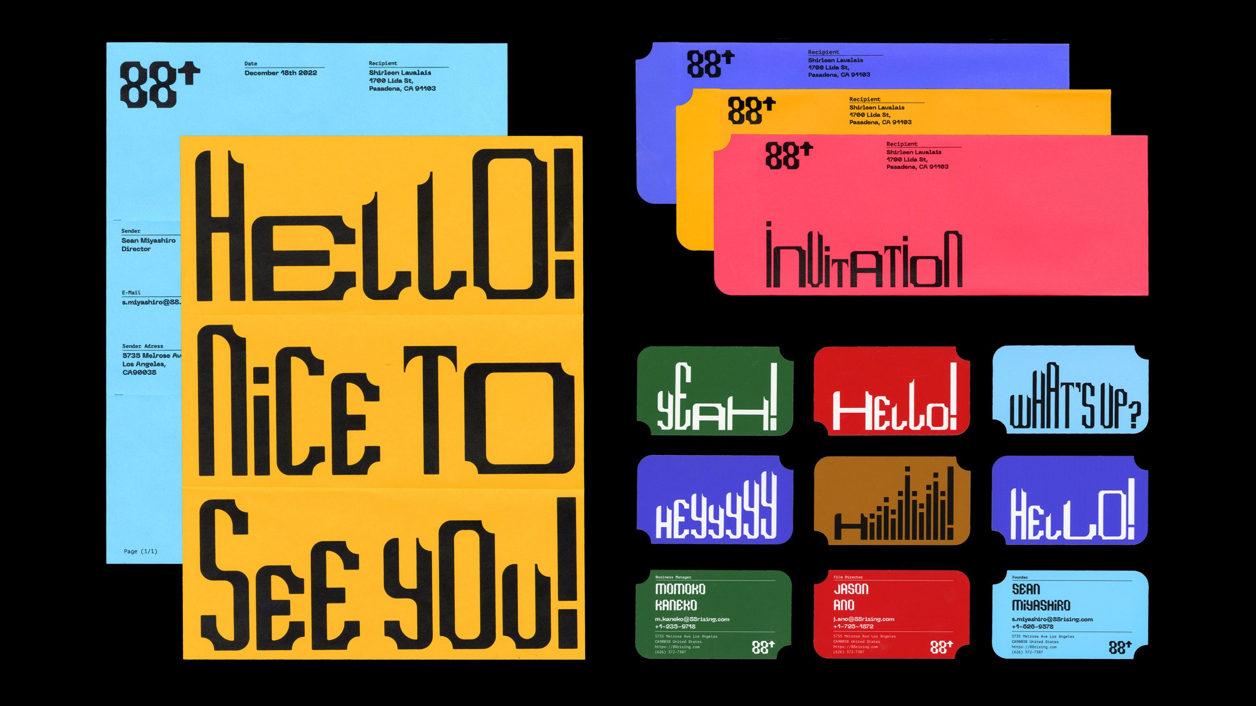


The typography is dynamic and versatile, rising to elevate important voices and break cultural boundaries. It has a sound-reactive feature to enhance the performance energy at the Head in the Clouds Festival.

Jo Iijima
I am Jo Iijima, a multidisciplinary graphic designer originally from Japan and currently residing in Pasadena. I specialize in brand identity, typography, and album artwork for musicians. I am originally from Japan and currently living in Pasadena. I have lived in a variety of different cities around the world, including Tokyo, Hong Kong, Vienna, Toronto and New York. These diverse experiences have enriched my personal understanding of the world. By growing up in and experiencing diverse cultures, I have always enjoyed looking at the graphics and posters found in different cities.
As a visual communicator, I am interested in knowing how our perception is influenced by and reacts to different design elements, including color, typography and shape.